Designing Trust for Emotionally Sensitive Users

Project
Bilingual therapist website
Scope
Brand identity · Trust-led UX/UI · Scalable bilingual architecture · Responsive Webflow implementation
Role
UX/UI Designer · Webflow Developer
Context
Independent client project
End-to-end from concept to launch
Tools
Figma
Webflow
Outcome
Launched April 2026  •  First booking received  •  Ranking on Google within the first weeks of launch

Overview

A multilingual psychologist and trauma specialist whose practice combines clinical credibility with a warm, human approach to care.

I designed and launched her website as an end-to-end project, shaping the experience from structure and interface design through to multilingual implementation and launch preparation.

The goal was not simply to create an online presence, but to build a digital experience that could communicate trust, reduce hesitation, and guide users toward contact or booking with clarity and care, while staying true to the tone, values, and personality of her practice.

THE CHALLENGE

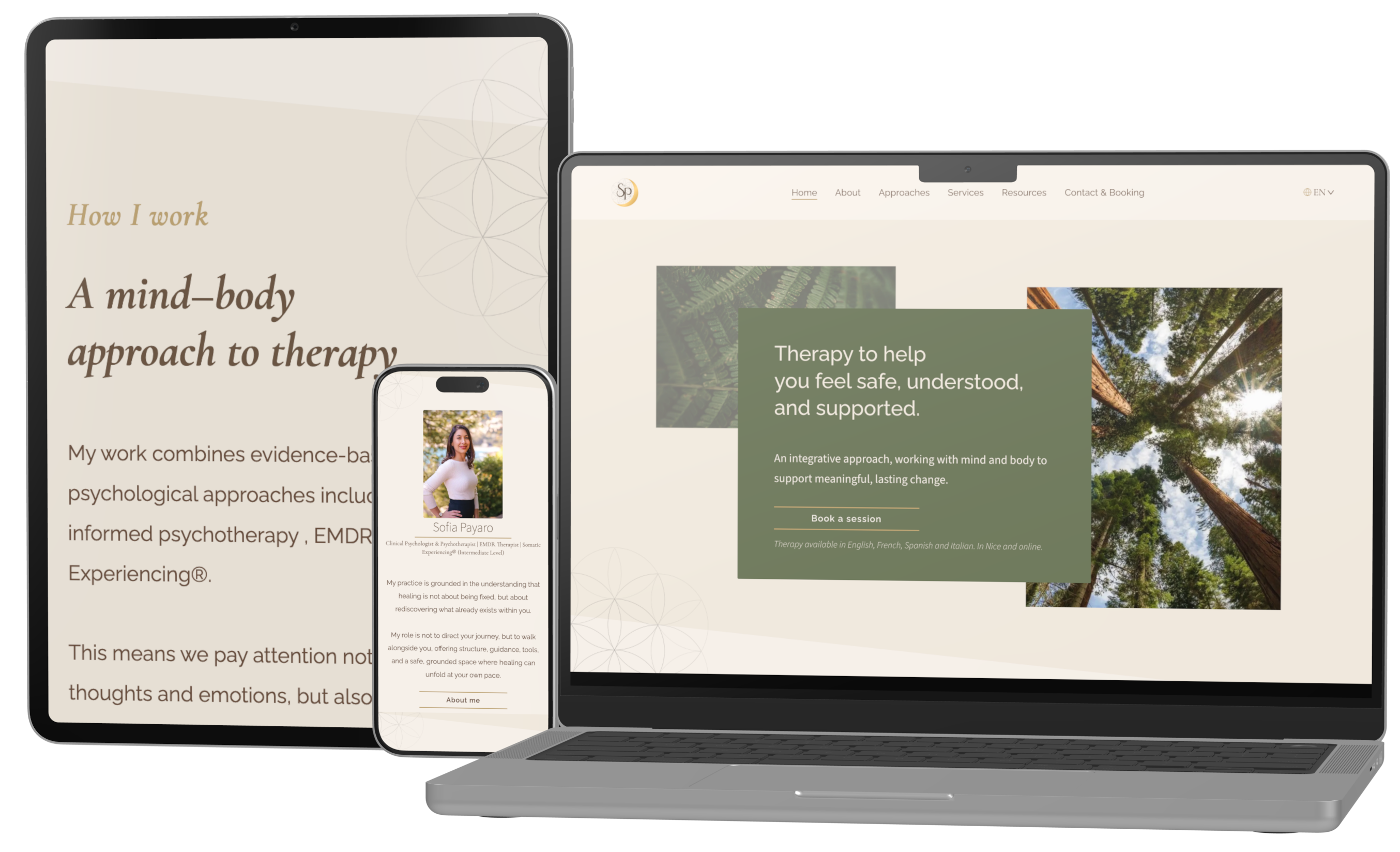
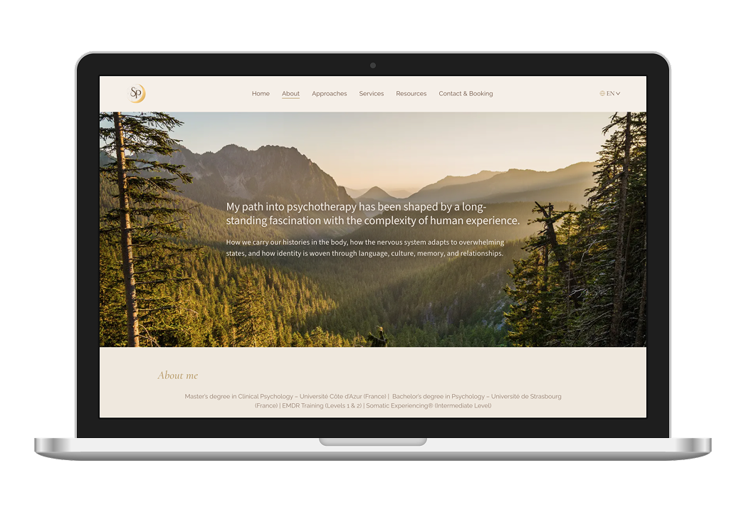
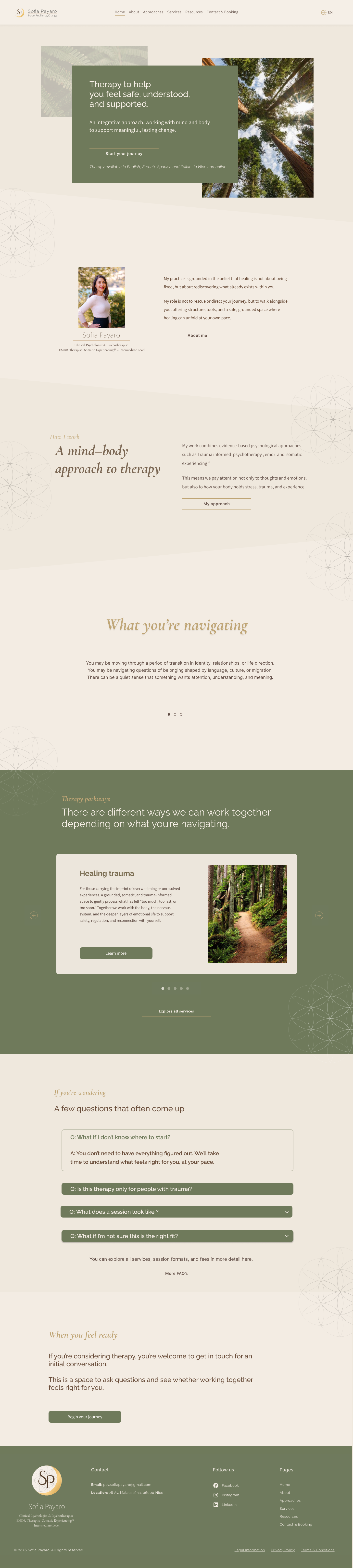
How do you design a therapist website for people who may be stressed, traumatised, overwhelmed, or unsure?

How do you keep the experience calm, warm, and trustworthy while still communicating real professional credibility, avoiding generic wellness clichés, and giving different users the level of reassurance they need?

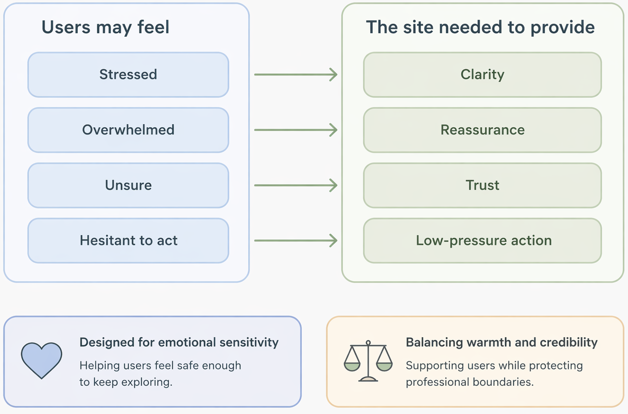
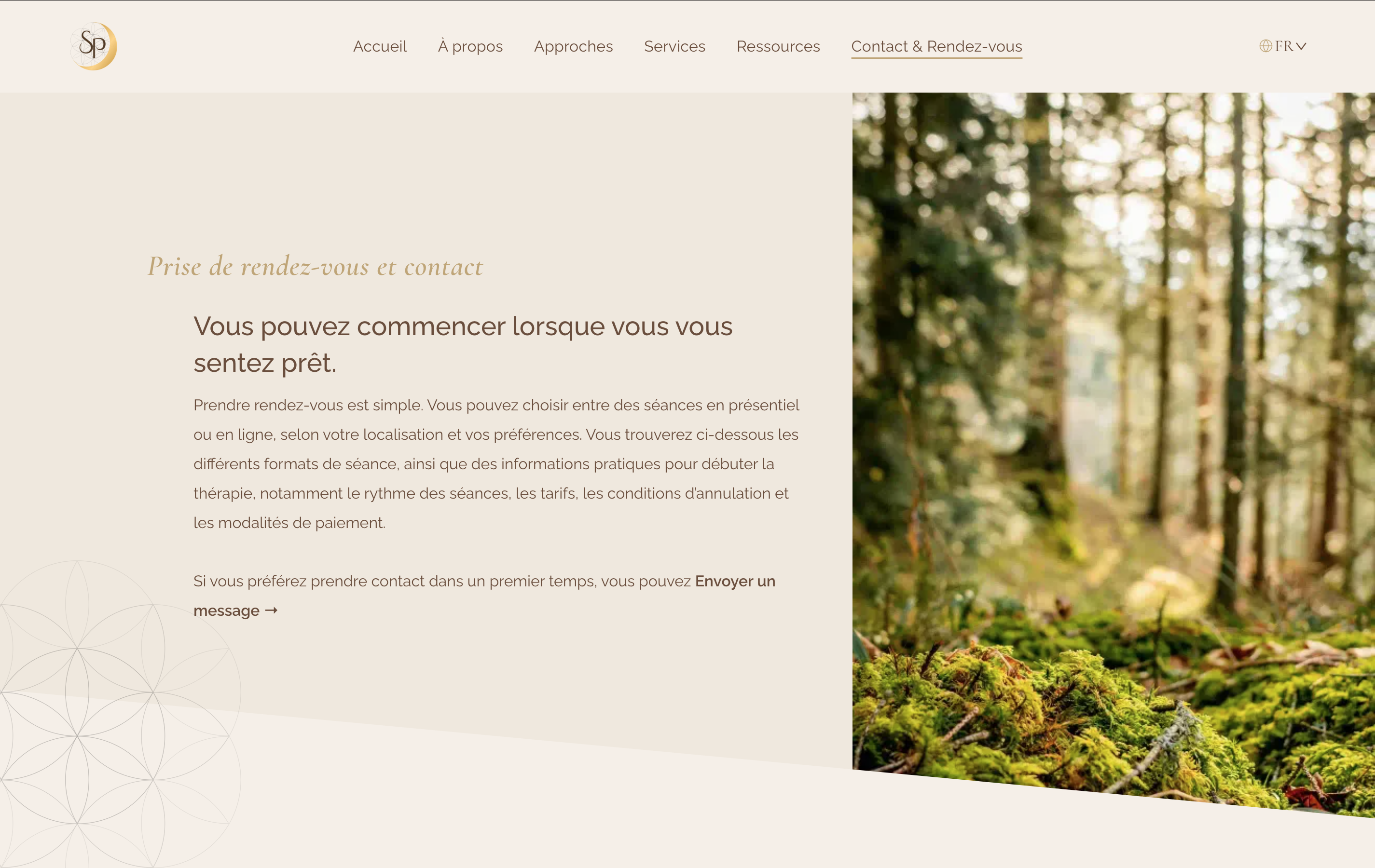
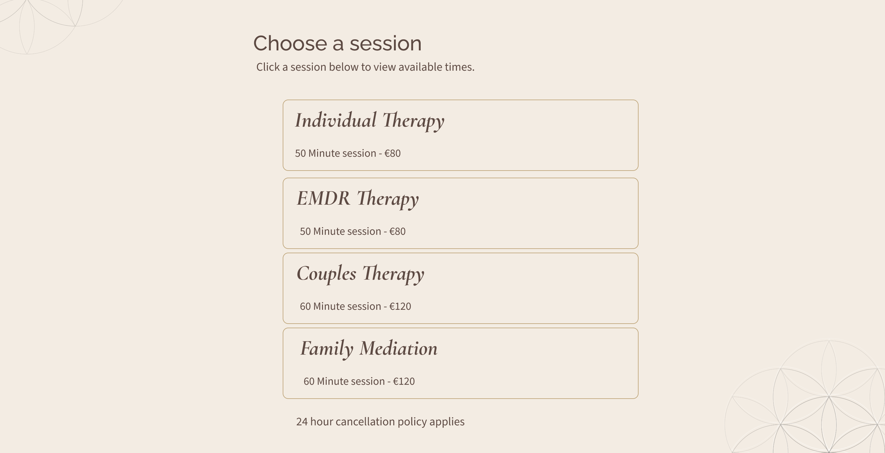
This project involved more than presenting information. It required designing for emotional sensitivity, different levels of readiness, and a service built on trust. Some visitors would want a quick, clear understanding of Sofia’s offer, while others would need more depth, reassurance, and time before feeling ready to take action.

The experience also had to support two sides at once: helping users feel safe enough to keep exploring, while also protecting the therapist’s credibility, clarity, and professional boundaries.

KEY DESIGN DECISIONS

The homepage was designed as a gradual trust-building journey, giving users clarity, recognition, and reassurance before asking them to take action.

Tap the dots to explore!
Reassurance before action
A calm, grounded first impression helps users feel safe before being asked to engage more deeply.
Quiet credibility
The image introduces Sofia as a person, while the serif credential treatment quietly reinforces clinical credibility.
Recognition before decision
Before presenting detailed service options, the homepage helps users identify with what they may be navigating, creating a softer bridge into therapy pathways and support areas.
Contact before commitment
For users who scroll deeper, the site answers hesitation and offers contact as the next step rather than pushing immediate booking.
Human intro before depth before action
Therapist appears just below the fold, building familiarity before the site moves into therapeutic detail.
Nature-led rhythm
Angled section transitions were used to echo light filtering through trees, extending the nature-led brand language into the page structure itself.
Anticipating user questions
FAQs were tailored page by page to answer the questions users were most likely to have at each stage of the journey.

Reassurance before action

A calm, grounded first impression helps users feel safe before being asked to engage more deeply.

Quiet credibility

The image introduces Sofia as a person, while the serif credential treatment quietly reinforces clinical credibility.

 Human introduction before depth

Sofia appears just below the fold, building familiarity before the site moves into therapeutic detail.


Nature-led rhythm

Angled section transitions were used to echo light filtering through trees, extending Sofia’s nature-led brand language into the page structure itself.

Recognition before decision

Before presenting detailed service options, the homepage helps users identify with what they may be navigating, creating a softer bridge into therapy pathways and support areas.

Anticipating user questions

FAQs were tailored page by page to answer the questions users were most likely to have at each stage of the journey.

Contact before commitment

For users who scroll deeper, the site answers hesitation and offers contact as the next step rather than pushing immediate booking.

Designing a low-pressure path, not just a booking funnel

Rather than pushing strong calls to action too early, I created softer secondary pathways throughout the site for users who needed more reassurance, using tonal color shifts and paced content sections to guide them calmly toward the next logical step.

Reducing cognitive load with progressive disclosure

Service and approach content was structured in two layers: concise summaries for quick orientation, and optional modal overlays for users who needed more depth before taking action. This kept the page scannable for anxious or uncertain visitors while still supporting users seeking more reassurance or detail.

Scope management: protecting launch quality

To avoid localisation costs, I structured the site manually, with French at the root and English in a subfolder.

This required more than translation alone: page duplication, language switching, internal linking, and SEO hygiene all had to remain consistent across both versions.

The result was a practical, cost-effective solution for the client and a clear bilingual experience for users, while also laying the groundwork for future language expansion.

Users could switch between equivalent pages in French and English
French
English

Simplifying booking to protect launch scope

Booking was originally planned as a simple calendar integration.

As the project evolved, the client introduced additional requirements that expanded it into a much more complex front-end decision flow, including online or in-person sessions, first sessions or follow-ups, multiple session types, locations, language preferences, and payment logic aimed at reducing no-shows.

This moved the feature well beyond its original scope, so rather than forcing that complexity into launch, I reframed it as a second-phase feature with its own budget and strategic attention. That allowed the site to launch sooner while leaving room to design the more advanced booking experience properly.

Original direction: simple booking by session type
Calendly modal
Service selection
Additional requirements expanded the booking flow

The result was a more practical launch solution that kept the path to booking clear for users while allowing the more advanced flow to be treated as a second-phase feature.

Revised phase-one solution

Results

The bilingual SEO architecture delivered measurable results within the first month of launch without any paid advertising.

Within 18 days of going live, the site generated 367 impressions and 36 clicks from organic search, with an average position of 5.9 on Google, placing it on page one for local searches. It now ranks for 27 distinct queries including competitive terms like "psychologue Nice," "psychothérapeute Nice," and "psychologue EMDR Nice," validating the bilingual structure and SEO architecture built into the site from day one.

Month One · Organic Search Performance
Found, not
advertised.
Indexed · ranking
Source · Google Search Console
Impressions
0
surfaced in search results
Clicks
0
qualified visits, no ads
Click-Through
0.0%
25% the local-services average
Avg. Position
0.0
Page one of results
Daily activity since launch
Clicks
Impressions
5 clicks · Apr 24 APR 12 APR 17 APR 22 APR 26 APR 30
Top ranking queries
Search Term Clicks Impr.
practitioner name
1441
psychologue clinicienne nice
16
psychothérapeute nice
19
psychologue nice
021
psychologue
05
psychologue autour de moi
03
psychologue emdr nice
03
emdr nice
02
nice psychologue
02
somatic experiencing
01
Showing 10 of 27 ranking queries
"
Indexed and ranking on page one within the first month — without paid acquisition.
The site surfaced for high-intent local searches: practitioner type, modality, and geography. The right people, finding the right pages, on their own terms.
27
Distinct queries indexed
9.8%
Click-through rate
Source: Google search console - 2026

OUTCOME & REFLECTION

Launch Status
Live • April 2026
Project type
End to end • concept to launch
Languages
French + English
SEO foundation
Ranking growth • ongoing
What worked
•   Emotional UX framing
•   Scope decision under pressure
•   Manual bilingual architecture
•   Trust-led content hierarchy
•   Strategic + design support combined
What I'd do next
•   Design phase 2 booking flow
•   Add analytics & heatmaps
•   A/B test CTA placement
•   Expand SEO content strategy
•   Reduce reliance on external directories
"You helped me create a website that genuinely feels like me. It feels professional, distinctive, and built with a real understanding of both my field and my long-term goals."
"You're not just building a website, you're also able to give valuable feedback on how potential clients will actually perceive the content. That perspective helped me make much better decisions."
Sofia Payaro
Multilingual psychologist & trauma specialist
DESIGNER’S REFLECTION
What this project reinforced was how often good design lives in the balance between competing needs — personal expression and professional credibility, emotional warmth and structural clarity, user sensitivity and business reality.
It was a strong example of shaping not just the interface, but the decisions around it.
Emotional UX
Scope management
Bilingual architecture
Trust-led design
Webflow
Client strategy
Next Case Study
Helping People Find And Support Charities
A homepage design for a charity discovery platform, created to help people find relevant NGOs and volunteering opportunities by cause or location, both locally and while travelling. The page was shaped to make the platform easier to understand, reduce content clutter, and guide users toward search, discovery, and involvement.
Project:
Charity discovery platform
Role:
UI/UX designer
Contribution:
Homepage design · UX structure · Visual storytelling

connect

IMPACTFUL
A good product is easy to use and easy on the eyes.

“Let’s make beautiful things that work beautifully.”!

I love working with teams and projects that value collaboration and meaningful solutions.

Let's talk