Competitive audit — key findings
Direct and indirect competitors audited across visual design, navigation, and search UX
.png)
Many platforms designed to connect people with volunteer opportunities were cluttered, difficult to navigate, and lacked intuitive ways to explore causes aligned with personal values and passions.
In addition, most existing websites failed to create a warm or trustworthy experience. They often felt either too casual or overly unprofessional, or visually unattractive, making it difficult for socially conscious users to engage meaningfully, which often discouraged users from actually volunteering, donating, or getting involved.
This created friction between the desire to give back and the ability to take action, especially for active travellers and individuals at home or abroad.
“It appeals to people who value giving back, rather than those looking for a tourist experience, and who want to make a real difference in the world.” —Client quote.
The client's vision was clear: a platform for people who want to do something real. Find causes, discover charities, volunteer abroad, connect with others who care, whether at home or on the other side of the world. Warm, inclusive, full of life. Cool without trying to be. A place that feels like a community before it feels like a directory.
The design challenge was to honour that vision without letting it compete with the platform's core function. Search leads. Everything else, the photography, the typography, the warmth, earns its place below the fold, where the journey begins. Find your cause, find your people, come alive.
I led the design from first wireframe to final UI, working through client and agency feedback, but driving the decisions on structure, visual identity, and interaction design.
The result is a platform that feels alive from the first scroll, warm enough to stay, clear enough to act, deep enough to come back to. The world opens up. The community is waiting.
.webp)
.webp)
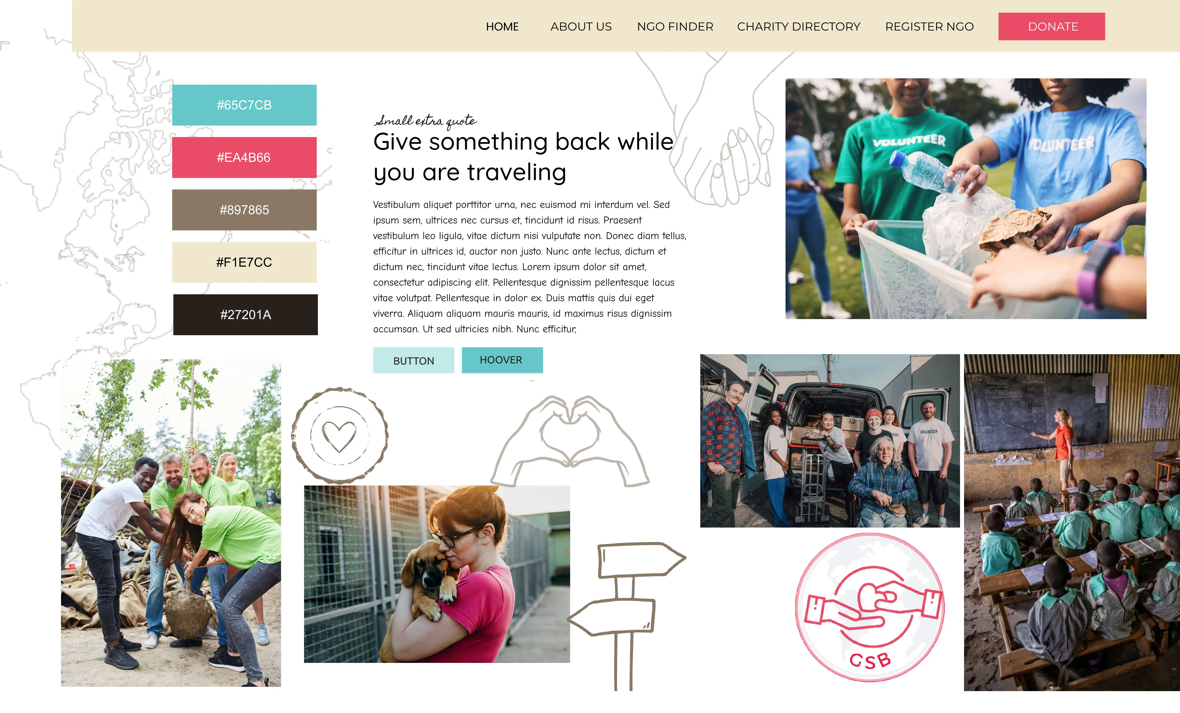
I began the research phase by reviewing the mood board and color palette suggestions provided by both the client and the agency. I also created my own color palette and reviewed all options with the agency to ensure alignment with the overall vision.
Direct and indirect competitors audited across visual design, navigation, and search UX
Finding 01 — Visual design
Many charity and volunteer platforms were visually unappealing and text heavy with a utilitarian feel that worked against engagement. For a younger audience of travellers looking to connect with causes, nothing felt inspiring or worth stopping for.
GSB Response
A photography-led identity rooted in nature, community, and growth imagery and colour chosen to feel warm, trustworthy, and inspiring for travellers and young people who want to give back, not just browse.
Finding 02 — Search & filters
Some competitors buried search under walls of text, categories and lists. Users didn't know where to begin. Few let you combine cause and location in one flow, others forced you to pick from one list, then another.
GSB Response
A single search bar as the entry point, with filters that reveal on engagement, keeping the page clean for browsers. Returning users who know what they want get straight to it, no lists, no noise.
Finding 03 — Navigation
Competitor sites felt like directories, not communities. Information was presented but no journey was created, nothing drew users in or made them feel part of something worth joining. For an audience motivated by purpose, nothing inspired action or belonging.
GSB Response
An immersive, progressive experience, content revealed as the user moves through the page. Secondary actions (donate, newsletter, register) are present but don't compete, keeping the journey feeling premium and intentional.
The hero section went through four iterations, each shaped by client feedback and budget realities. Here's how each constraint pushed the design forward.
01 — Client brief
The client's initial vision
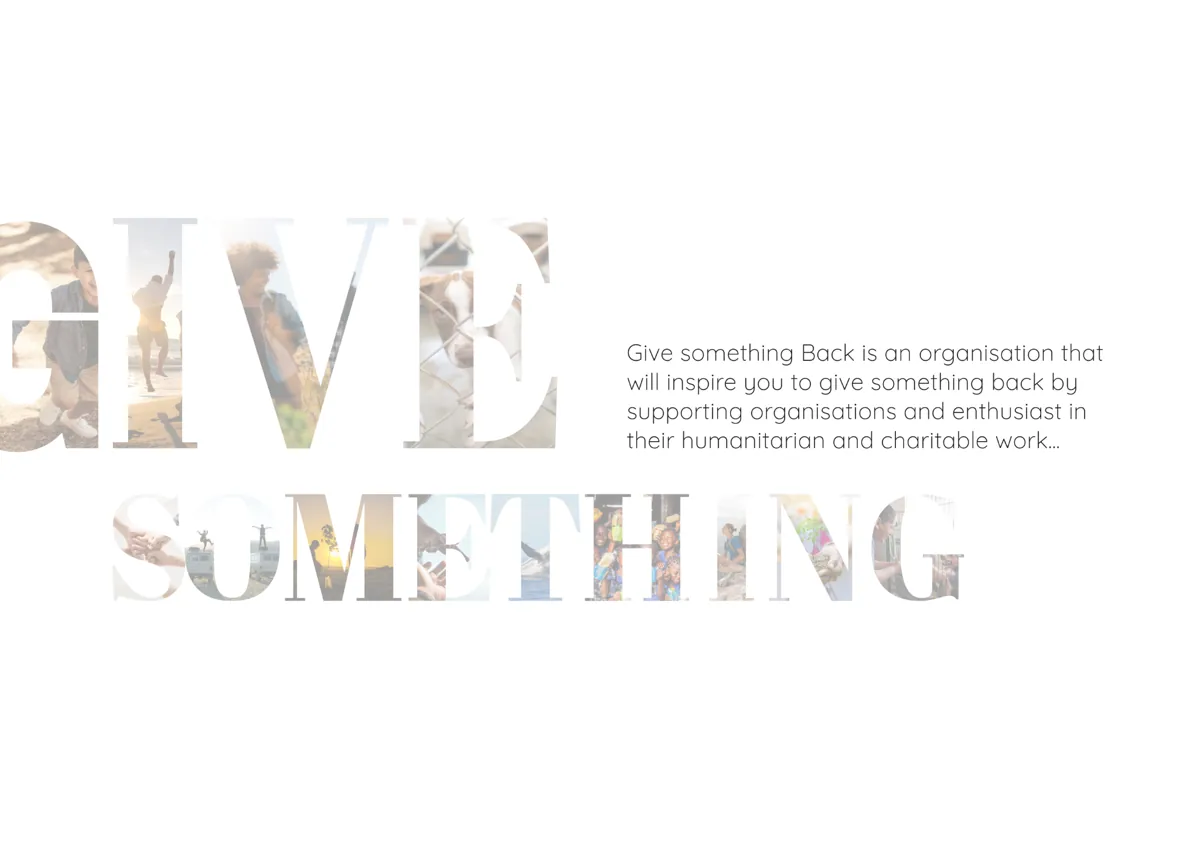
The client's vision was a collage of charity imagery. Emotionally rich, but placed behind the search bar it would dilute and compete with the platform's core action. I raised the issue early and kept the search bar as the clear priority.
02 — Adaptation
Honouring the brief, solving the problem
Rather than dismissing the client's vision, I reframed it: a typographic image mask spelling 'Give Something' moved below the hero so it could live as a statement piece without disrupting the search flow.
03 — Explored, scoped out
Right idea, wrong phase
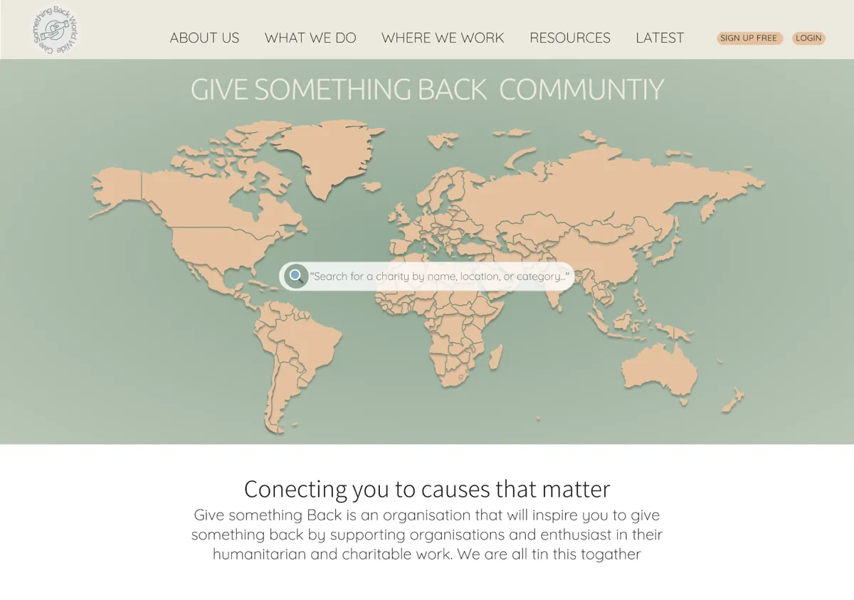
An interactive map would have communicated the platform's global reach instantly. But the build complexity would have delayed launch and risked the quality of everything around it. Scoping it to Phase 2 kept the hero clean and the launch on track, documented and ready to build properly when the time comes.
Usability through motion
To solve the cause and location problem, I designed a search bar with filters that reveal only on engagement. Location and category expand together in one flow, keeping the page clean until the user is ready to search.
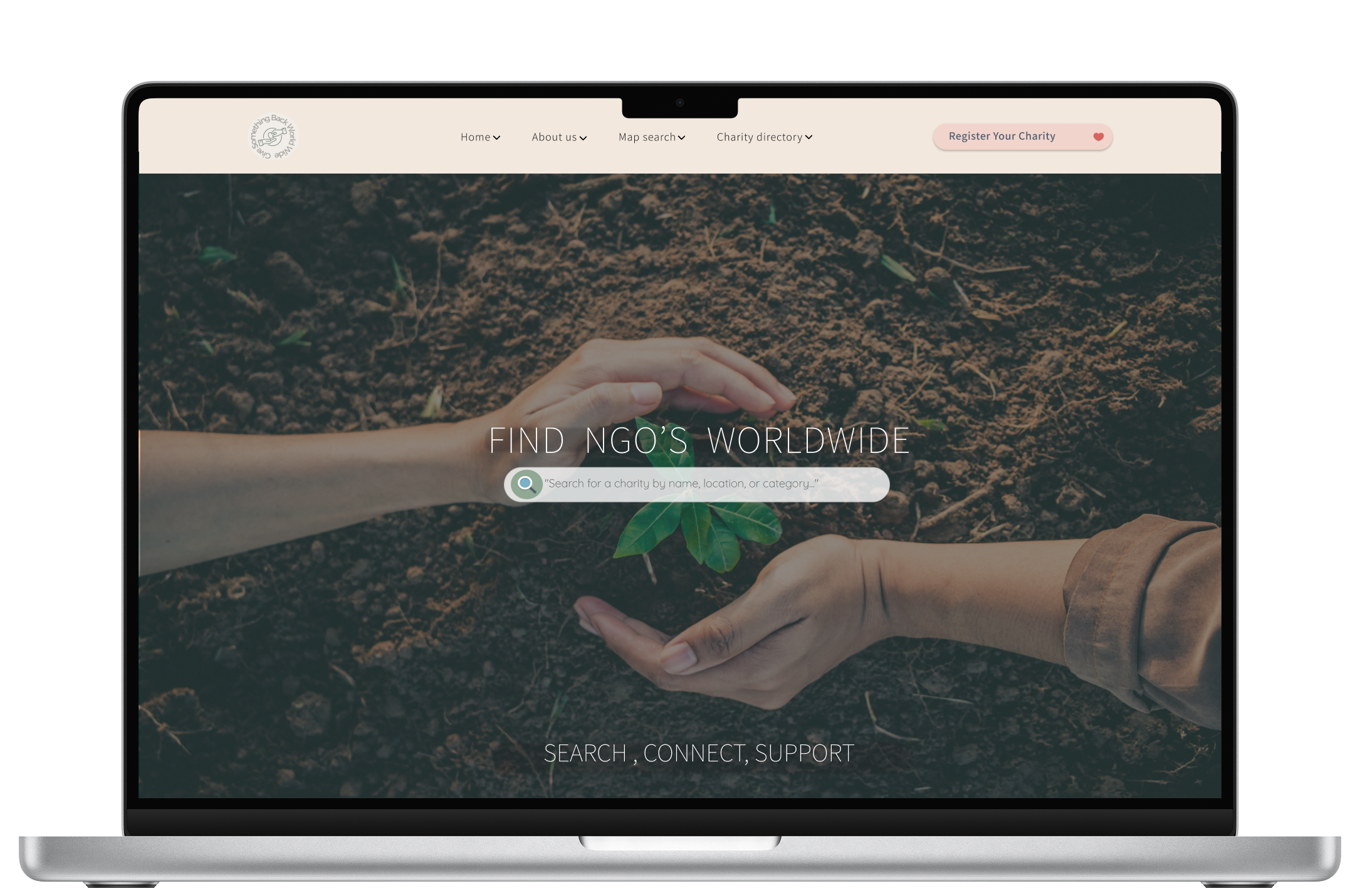
05 — Final
Function, clarity, and emotional resonance
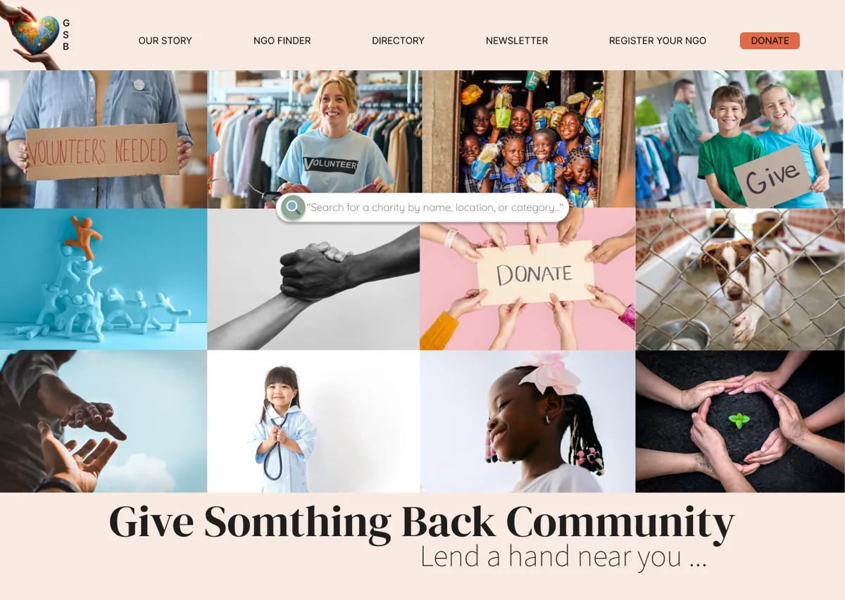
The headline tells you exactly what to do the moment you arrive. The search bar became the visual centrepoint, with animated pop-out filters for location and category. The photography communicates human connection without the fragmentation of a collage.
Design Rationale
Every iteration responded to a real constraint, client vision, budget, scope. The discipline was in treating each constraint as a design input rather than a blocker. The collage became a typographic feature. The map became a Phase 2 recommendation. The animated filters solved the cause and location problem without adding visual noise. The budget forced a clarity the original brief never would have.
The full design
A calm, grounded first impression helps users feel safe before being asked to engage more deeply.
The image introduces Sofia as a person, while the serif credential treatment quietly reinforces clinical credibility.
Sofia appears just below the fold, building familiarity before the site moves into therapeutic detail.
Angled section transitions were used to echo light filtering through trees, extending Sofia’s nature-led brand language into the page structure itself.
Before presenting detailed service options, the homepage helps users identify with what they may be navigating, creating a softer bridge into therapy pathways and support areas.
FAQs were tailored page by page to answer the questions users were most likely to have at each stage of the journey.
For users who scroll deeper, the site answers hesitation and offers contact as the next step rather than pushing immediate booking.
The client's original collage concept reframed as a typographic feature. Moving it below the hero preserved the emotional idea without letting it compete with the search bar the platform's core action.
Simplified from five features to three trust signals. For a platform asking people to donate time and money, establishing trust matters more than listing functionality.
The client wanted thin, elegant and feminine. Quicksand brings warmth to headings without feeling decorative. Assistant keeps body text light and refined, credible enough for a platform asking people to trust it with their time and money.
Each card leads with photography, not a category label. A text-heavy card tells you what a cause is. An image makes you care about it and caring is what converts.
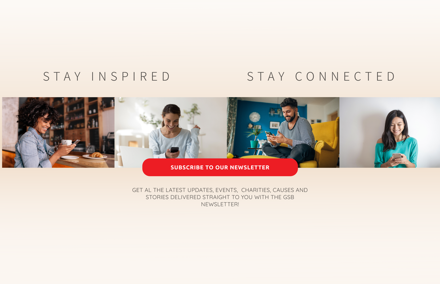
Giving back is a global community, not a solo act. Staying connected to others who share your values is what keeps the motivation alive. Anyone, anywhere can find their cause and find their people.
Not every visitor is a donor. Sage green signals a different audience and carries the right weight. Action, growth, forward motion. The colour does the work before the copy does.
client response
Client confirmed the design captured the platform's vision
phase 1
Landingpage design, animated search bar, clear CTAs
phase 2
Scoped and ready, paused externally.