
This UX case study explores a mobile-first camping store app designed to reduce friction throughout the gear-buying journey.
The solution focuses on clear categorisation, guided discovery, and scannable product information to help users quickly find gear that fits their experience level and camping style.
Sustainable options are integrated in a clear and accessible way, allowing users to make value-based choices without adding complexity to the shopping experience.
Camping Store App Case Study
A mobile-first camping store app concept focused on simplifying online gear shopping for campers, from beginners to eco-conscious families.
Designed to support clear decision-making, guided discovery, and sustainable choices across a wide range of camping styles.
THE CHALLENGE
THE CHALLENGE
Camping has seen a surge in popularity, but buying camping gear online can feel overwhelming and inconsistent, particularly for beginners and busy families.
Users often struggle to understand what equipment they actually need, compare products confidently, and trust that their choices suit their camping style and values, such as sustainability.
The challenge was to design a mobile-first shopping experience that simplifies gear discovery, reduces cognitive load, and supports confident, informed decision-making across a wide range of user needs.
THE SOLUTION
THE SOLUTION
RESEARCH & DISCOVERY
RESEARCH & DISCOVERY
User Research Methods
To simulate real user insightst:
I used persona prompt generators to define baseline user types.
Conducted informal interviews with friends who camp regularly.
Reflected on my own camping habits to identify common behaviors and frustrations.
This approach allowed me to empathize with a range of potential users despite the limitations of a student project.
Key Personas Identified
SARAH
(Eco conscious user)
Seeks sustainable, high-quality gear and trustworthy product reviews.
Problem
Needs to quickly compare sustainable gear but struggles with cluttered, untrustworthy sites.
Hypothesis
If sustainability info and reviews are clear, she can make confident purchases faster.
JAIME
(Casual adventurer)
Wants quick gear suggestions and simple guides for spontaneous weekend getaways.
Problem
Doesn’t have time to research gear or learn everything needed.
Hypothesis
If the app offers beginner guides and quick gear recs, he can plan spontaneous trips with less stress.
LINDA
(Older enthusiest)
Prioritizes comfort, expert recommendations, and accessibility.
Problem
Overwhelmed by too many options and unclear product details.
Hypothesis
A curated gear system, authentic reviews, and comparison tools can help her shop with ease and confidence.
MARK
(Family camper)
Needs durable, affordable, kid-safe gear and trip planning support.
Problem
Mark is a busy father who needs a mobile frindly experince becuase he struggles to compare family camping products online, especially on his Mobile.
Hypothesis
A mobile-friendly, intuitive UI will allow him to shop efficiently on-the-go.
Competitive audit & key insights
I evaluated five leading camping gear sites to identify usability patterns across mobile design, accessibility, and product clarity.
Common issues included cluttered layouts, confusing menus, and weak sustainability filters—frustrating for users like Jamie, Mark, and Sarah.
Overwhelming imagery and low-contrast interfaces also posed challenges, especially for older users like Linda.
Revisiting these audits during prototyping helped validate key design choices, like mobile-first layouts, icon-based trust signals, and a reintroduced gear comparison feature.
These insights directly shaped a cleaner, more accessible shopping experience for a wide range of camping styles.
USER FLOWS & WIREFRAMES
USER FLOWS & WIREFRAMES
User flows designed
These flows address different user intents—from quick decisions to in-depth product comparison.
The quick path for users like Jaime
The path of comparison for users like Linda and Sarah
Wireframes & Ideation
During the ideation phase, I began translating my research insights into tangible layout concepts and early wireframes.
I focused on aligning each design decision with my key user personas and usability principles.
These screens were prioritized to support both quick-path flows for casual users like Jamie and more in-depth exploration for users like Linda and Sarah.
- Homepage
- Menu
- Search Results
- Product Details
- Cart
- Checkout
- Confirmation
- Compare items
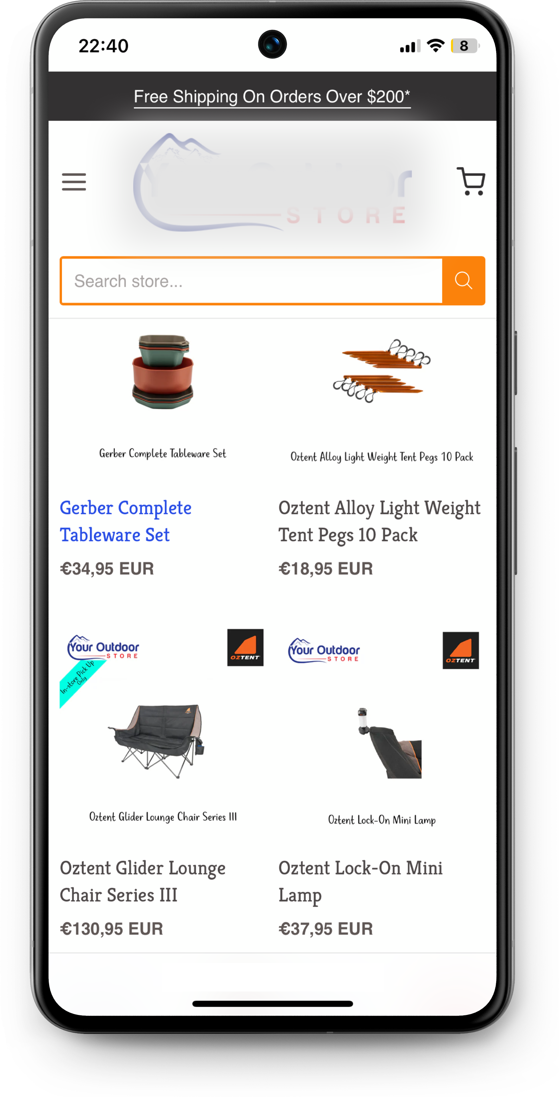
The homepage prioritized a search bar, a compact hero image to reinforce brand identity, the icon explanation system, and a guide section—keeping everything scannable above the fold. The layout remained simple and spacious to avoid clutter.
FEATUURE CONCEPTS
FEATURE CONCEPTS
Icon-Based Rating System
EARLY ICON CONCEPT
Low
Mid
High
Interactive Map (Cut Feature)
I explored the idea of an interactive gear-recommendation map based on camping location and experience level. While promising, it was deemed too complex for the project scope and timeline, so I deprioritized it.
compare feature
Initially unsure about implementing a compare feature, I reconsidered after finding a strong example in a competitor audit.
I designed a comparison tool that allowed users to view side-by-side gear specs and ratings. This was ideal for personas like Linda and Mark.
This feature was especially relevant to Linda, who prefers side-by-side product comparisons to avoid second-guessing, and to Jamie, who benefits from quick overviews without digging deep into multiple product pages.
TESTING & PROTOTYPING
TESTING & PROTOTYPING
feedback & iteration
I reviewed my wireframes with peers and evaluated them using UX heuristics. Based on that feedback, I made several key updates:
Before
- Evolving checkout to a step-by-step experience with a progress bar for smoother and less intimidating and overwhelming flow.
AFTEr
- This approach aligned with user expectations and made the process more digestible, especially for mobile users. It also supported users like Linda, who benefit from reduced cognitive load, and Mark, who values clear steps when shopping with family distractions.
- Simplified navigation by adding "Continue Shopping" prompt.
- These adjustments were guided by Jakob’s Law, accessibility best practices, and responsive design patterns I gathered from competitor audits and UX articles. They were especially important for multitasking users like Mark, who benefit from consistent button placement and minimal friction across devices.
- Added Suggestion section for the comparison feature
Clickable lofi Prototype & Review
I created and tested a clickable prototype to simulate both user flows and evaluate how the structure and interactions performed in context.
During testing, I realised that users needed clearer feedback after taking key actions. As a result, I added dedicated confirmation modals for:
- Item added to cart
- Item added to compare
These modals helped reassure users that their action was successful and offered options to either continue shopping or review their cart/compare list.
The prototype also validated earlier updates such as:
- Navigation prompts like Back to Shopping or continue shopping
- Suggested comparion items
- Checkout transformation
These refinements were especially valuable for users like Mark, who may be shopping quickly while multitasking and need immediate visual confirmation and clear, uninterrupted next steps.

OUTCOME& IMPACT
OUTCOME & IMPACT
Key Takeaways
Even in early-stage or low-resource projects, scrappy research can lead to rich insights. By combining persona development, informal interviews, competitor audits, and self-reflection.
I gained a holistic view of user needs across ages, experience levels, and camping styles.
These insights strongly influenced the app’s information architecture, homepage layout, product filtering logic, and interaction design.
Choices like the icon system, compare feature, and checkout flow were all shaped by those learnings and aligned with user expectations.
I also designed with a mobile-first mindset to support users like Mark and Jamie, ensuring smooth, responsive interactions across devices through accessibility checks and layout adjustments.
Designing for users like Linda and Mark, who benefit from reduced cognitive load, also reinforced the importance of visual clarity, progressive flow, and actionable feedback in high-stress or multitasking moments.
Ongoing Work & Reflections
This case study represents an ongoing UX exploration.
In the next phases, I plan to continue refining key flows like comparison, checkout, guides and gear recommendations.
I’ll also move into designing high-fidelity mockups to further develop the visual language and testable UI components.
This project helped me grow not only as a designer, but as a researcher and product thinker. It reinforced how even lean research can drive smart decisions and how small interface details, like confirmation feedback and accessible layouts, can meaningfully improve the user experience.
