Discover. Connect.
Make an Impact.

Designing a website that makes finding and supporting charities effortless. Whether you're at home or traveling the world.

THE CHALLENGE
THE CHALLENGE

We set out to solve the problem of connecting people with meaningful volunteer opportunities that align with their values and passions. Existing websites were often cluttered, hard to navigate, and lacked intuitive search filters.

Existing websites were often cluttered and hard to navigate. Additionally, most sites were unattractive and failed to create a warm or inviting atmosphere. They either felt too casual or unprofessional, making it difficult to engage users meaningfully.

The platform targets active travellers, socially conscious individuals, and those seeking meaningful ways to contribute to local communities.

“It appeals to people who value giving back, rather than those looking for a tourist experience, and who want to make a real difference in the world.”

We also wanted the platform to feel welcoming, trustworthy, and inspiring something that encourages users to engage meaningfully, whether they’re at home or abroad.

THE SOLUTION
THE SOLUTION

The platform needed to help people find NGOs near them or in places of interest, sign up for newsletters, donate to causes, and provide NGOs with a way to register themselves. To achieve this, the solution focused on the following design goals:

  • Design an easy-to-navigate platform that allows users to discover relevant NGOs and volunteer opportunities by location and charity type.
  • Create an engaging and visually appealing UI that reflects the brand's identity and encourages users to take meaningful action.
  • Provide clear calls-to-action (CTAs) for donations, charity sign-ups, and user engagement.
  • Foster awareness and connection with charities, allowing users to explore organisations locally or at their travel destinations.
  • Design an easy-to-navigate platform that allows users to discover relevant NGOs and volunteer opportunities by location and charity type.
RESEARCH & DISCOVERY
MOODBOARD & COLOUR PALLET

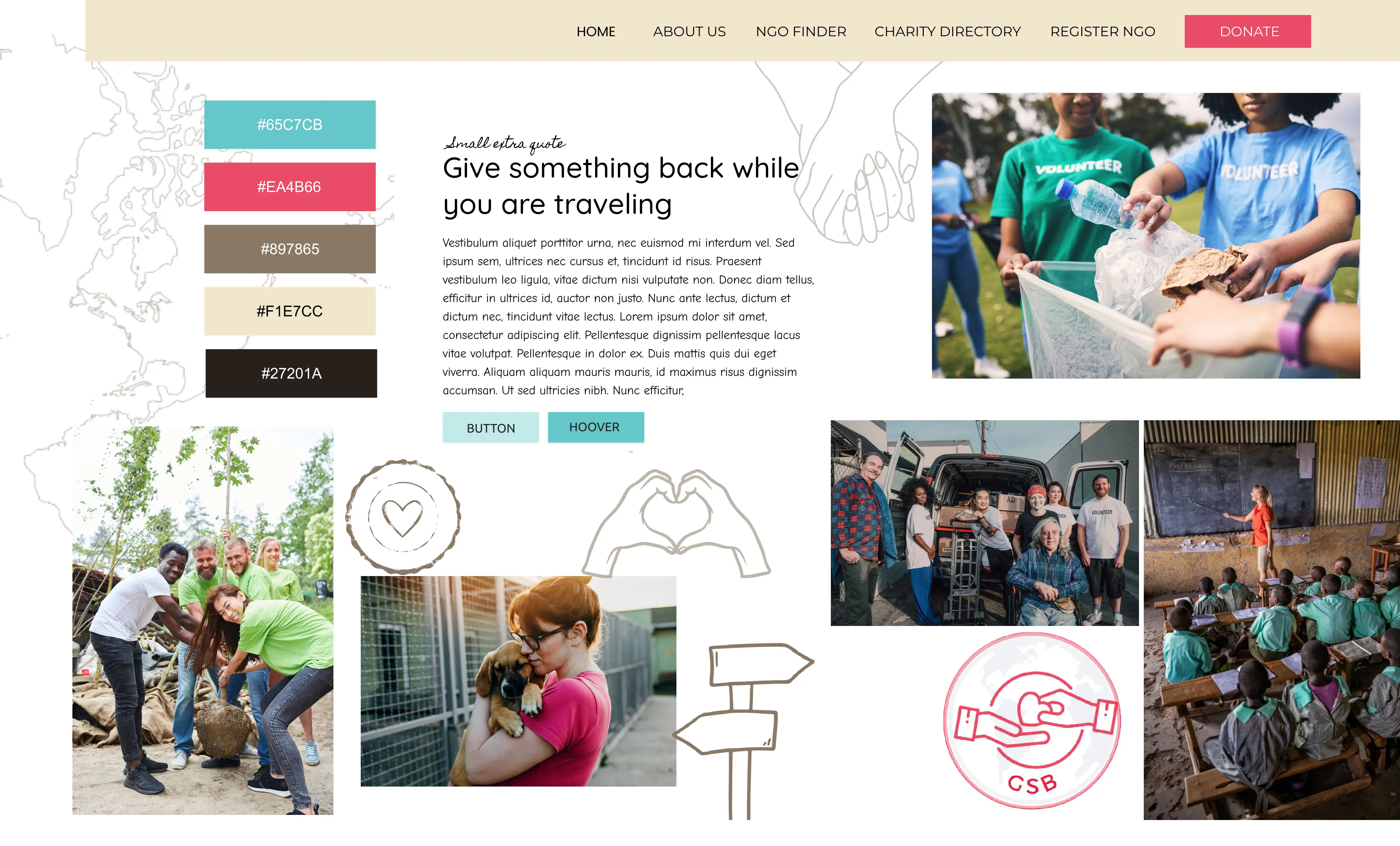
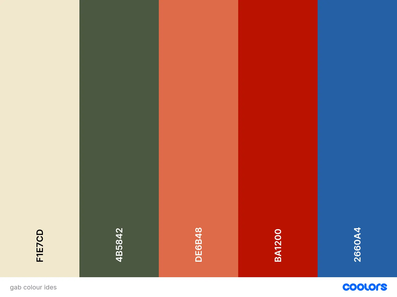
I began the research phase by reviewing the mood board and color palette suggestions provided by both the client and the agency. I also created my own color palette and reviewed all options with the agency to ensure alignment with the overall vision.

Typography

The client shared websites they admired for their style, which helped me understand the aesthetic direction they were looking for. To further explore this, I created basic typography mockups and design samples based on the mood boards to showcase how different styles could capture the desired feel.

Give Somthing Back Community

Lend a hand near you

These fonts were inspired by the website “Notice the reckless”. It is made up of 2 fonts. The Header is ‘Kb Plane earth’ medium weight.

‘Kb Planet earth’  Gives a hand drawn feel, friendly, homemade, youthful, alternative feel

And body text ‘Poppins’ is just boosting the body a little bit while still giving good readability whilst staying elegant and stylish.

Give Somthing Back Community

Lend a hand near you

These fonts were inspired by the website “Form”. It is made up of 3 fonts. The Header is ‘DM Serif display’ Matched with the elegant “source sans pro extra light” and body text ‘DM sans’

‘Dm Serif Display’ shines most larger sizes so great for hero text, poster text, large, important, impactful and still and bit fun/friendly with its shapes. Contrasting with the delicate refined elegant sub heading Source sans pro extra light.

And body text "dm sans" just boosting the body a little bit while still giving good readability, whilst staying elegant and stylish.

Give Somthing Back Community

Lend a hand near you

These fonts were inspired by the website “Red Barna ”. It is made up of 2 fonts.

The Header is ‘Oswald’ in  semi bold  and sub heading is “oswald’  in regular.

Oswald feels bold, impactful and  has a more serious tone and call to action kid of feel.

Matched with "Lato" which  feels modern without feeling to trendy and  very easy to read so good for displaying a lot of information.

COMPETITIVE RESEARCH

In addition to the provided materials, I conducted my own competitive research, analyzing both direct and indirect competitors.

This research revealed several key insights:

Insight: The majority of sites audited lacked visual appeal, with poor use of colors and imagery, resulting in an un-engaging user experience.

Insight: Some sites featured search filters that were overcrowded and poorly designed, leading to confusion and an unattractive interface.

Insight: Many sites had a cluttered structure, making it difficult for users to scan and navigate efficiently.

PROCESS HIGHLIGHTS
PROCESS HIGHLIGHTS

IDEATION & WIREFRAMING

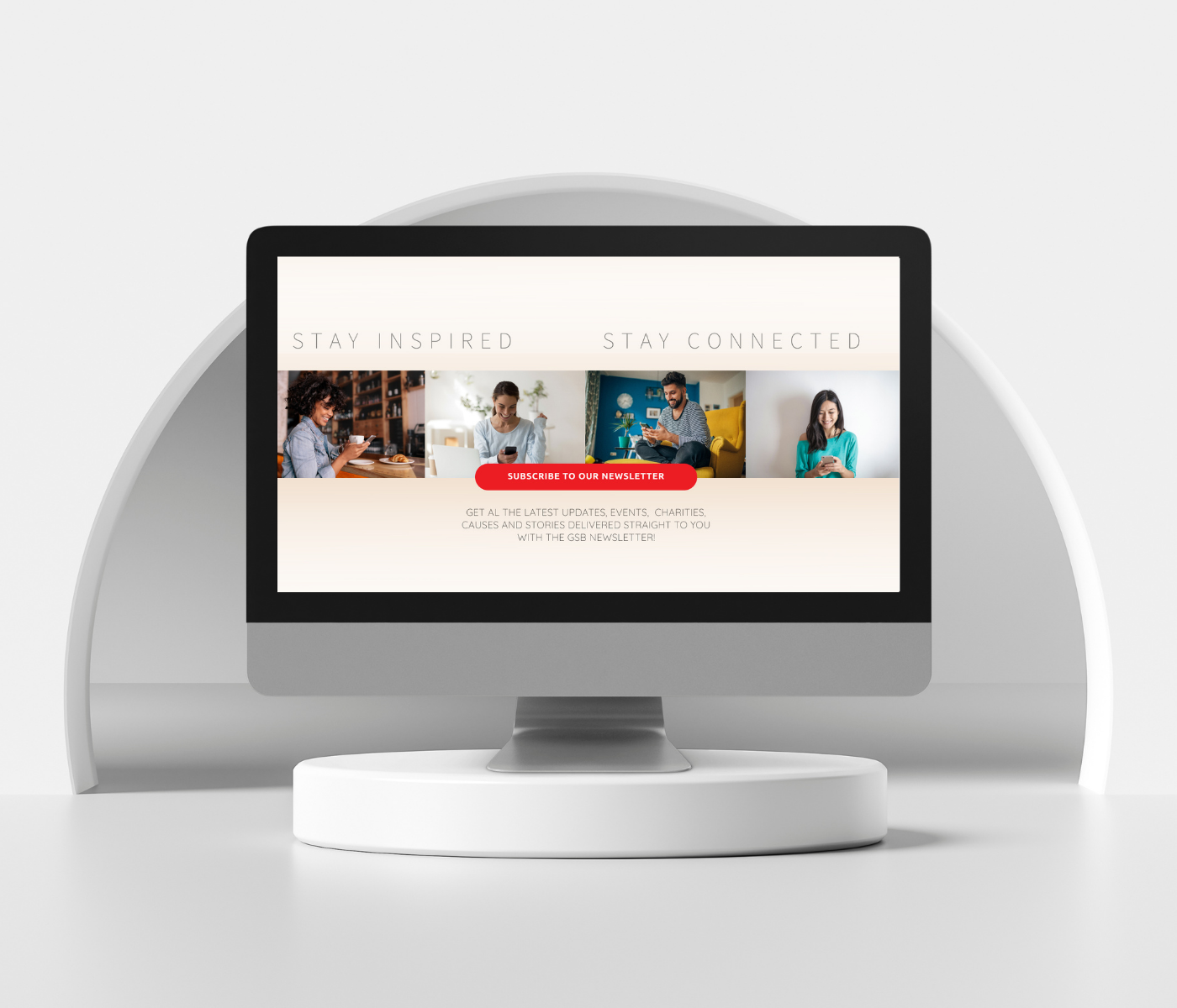
Using a proposed content list from the client and agency as a starting point, I outlined the homepage structure with key sections like the header, search bar, mission statement, featured charities, and newsletter prompt. This approach helped me visualise the user flow and ensure all essential elements were included.

As I created low-fidelity wireframes, I quickly realised some sections were unnecessary and made the layout feel too busy. To improve flow, I removed two sections, reordered others, and moved the login to the footer, reducing clutter and highlighting the most important user actions.

Hero Section Evolution Through Constraints & Collaboration

INITIAL CLIENT REQUEST

The client initially envisioned a collage-style image as the main visual in the hero section.

However, this approach distracted from the core functionality of the homepage—the search bar.

FIRST ADAPTATION -IMAGE MASKING

Rather than removing the idea entirely, I adapted the concept by using image masking with text to spell out 'Give Something.'

I placed this visual below the hero banner to maintain its impact without disrupting the page's clarity and focus.

INTERACTIVE MAP

I also explored the idea of an interactive map in the hero area to emphasize the global aspect of the platform.

However, due to budget and scope constraints, I pivoted to a cleaner and more achievable solution: a static image overlay featuring the message 'We are all in this together.' This aligned with the brand’s message and visual identity while keeping the design clean and functional.

ANIMATED SEARCH BAR 

To further enhance both aesthetics and usability, I designed an animated search bar with pop-out filters to create a more intuitive and engaging interaction.

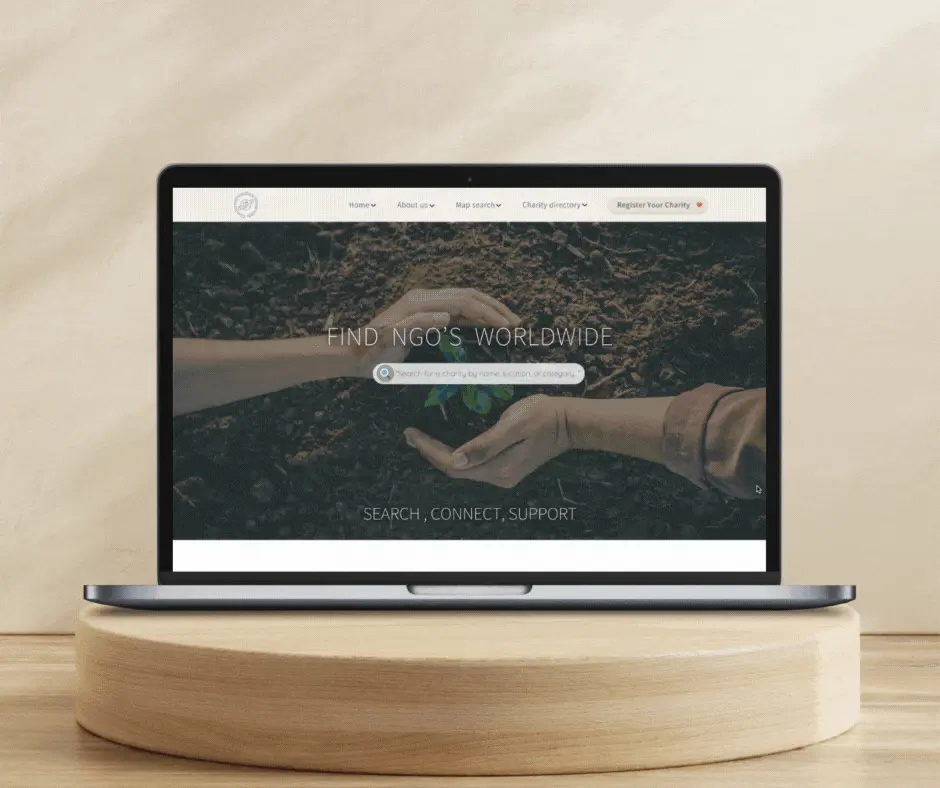
FINAL HERO 

I finalised the hero section with a revised headline: 'Search, Connect, Support: Find NGOs Worldwide,' clarifying the search bar’s purpose and reinforcing the platform's mission with a strong, actionable message.

OUTCOME & IMPACT
OUTCOME & IMPACT

Working with the agency to incorporate client feedback has been essential in ensuring the design aligns with the client’s vision. The iterative process has proven valuable, allowing us to adapt quickly while balancing creativity with practical constraints.

This project has been an exciting opportunity for collaboration and growth. The client has expressed positive feedback, particularly regarding the clean layout and intuitive navigation. While we've made good progress, the design is still evolving, and further user testing will help refine the experience as we move forward with the rest of the platform.

Next Case Study
Demystifying AI. One Scroll at a Time.
A human-centered one-page website that makes AI feel less like science fiction and more like a smart business solution. Designed to simplify complexity, build trust, and guide curious clients toward action—through thoughtful flow, clean visuals, and clear messaging.
Project:
Blipz.ai
Role:
Freelance UI/UX designer
IMPACTFUL
CONNECT
A good product is easy to use and easy on the eyes.

“Let’s make beautiful things that work beautifully.”!

I love working with teams and projects that value collaboration and meaningful solutions.

Let's talk