.png)
Making AI Consulting Easier To Understand
THE CHALLENGE
In late 2023 and early 2024, AI adoption was accelerating rapidly, yet many businesses struggled to understand how AI could be applied in a practical, meaningful way. While AI consulting services were emerging, most lacked a clear and approachable digital presence.
AI often felt overwhelming, abstract, or overly technical, creating uncertainty rather than confidence for potential clients exploring its value.
The challenge was to design a one-page website that makes AI feel cutting-edge yet human, helping businesses move from curiosity to clarity, and ultimately toward action.
THE SOLUTION
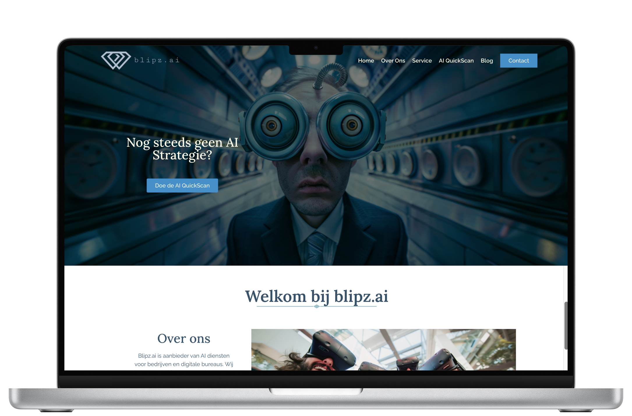
The solution was a clean, human-centered one-page website designed to educate, reassure, and guide potential clients toward action.
To reduce uncertainty around AI and build trust, the design focused on simplifying complex concepts through clear structure, approachable visuals, and a smooth, intentional scroll experience.
This approach helped position AI not as an abstract or intimidating technology, but as a practical business tool that feels accessible and relevant.
PROCESS HIGHLIGHTS
To make AI feel accessible, I first conducted a competitive audit of existing AI consulting websites. Most were text-heavy and lacked structure, which helped define my design direction: clean layout, simplified messaging, and engaging visuals.
Early wireframes revealed flow issues, transitions between sections felt jarring and repetitive. Through multiple iterations with the agency, I refined the layout to create a smoother scroll experience and cohesive visual rhythm.
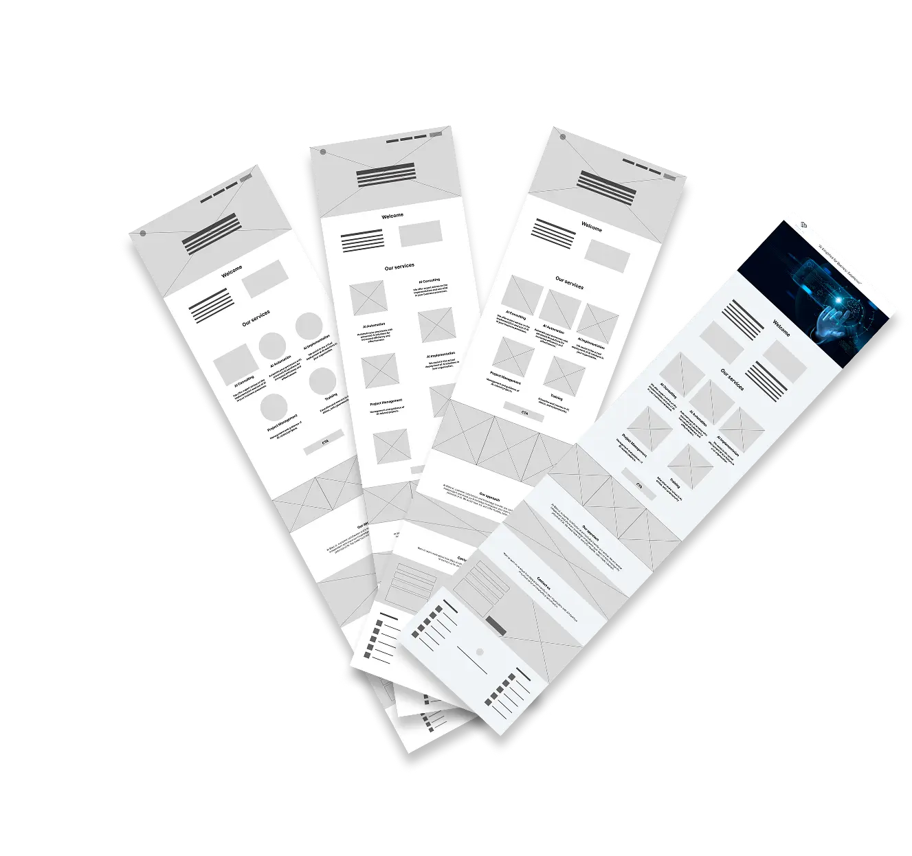
scannable module
DESIGN CHOICES
Brand Identity: Tech-forward,
modern, clean and trustworthy
Key design decisions are highlighted below to demonstrate how visual choices were used to build clarity, trust, and approachability.
TAP OR HOVER OFF TO REMOVE!

LOGO RECREATION
LOGO RECREATION
TYPOGRAPHY
IMAGERY
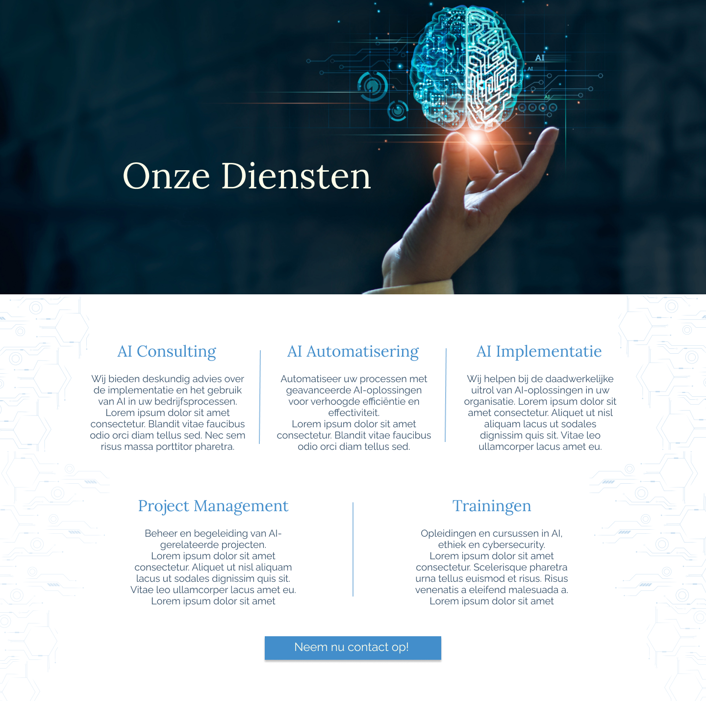
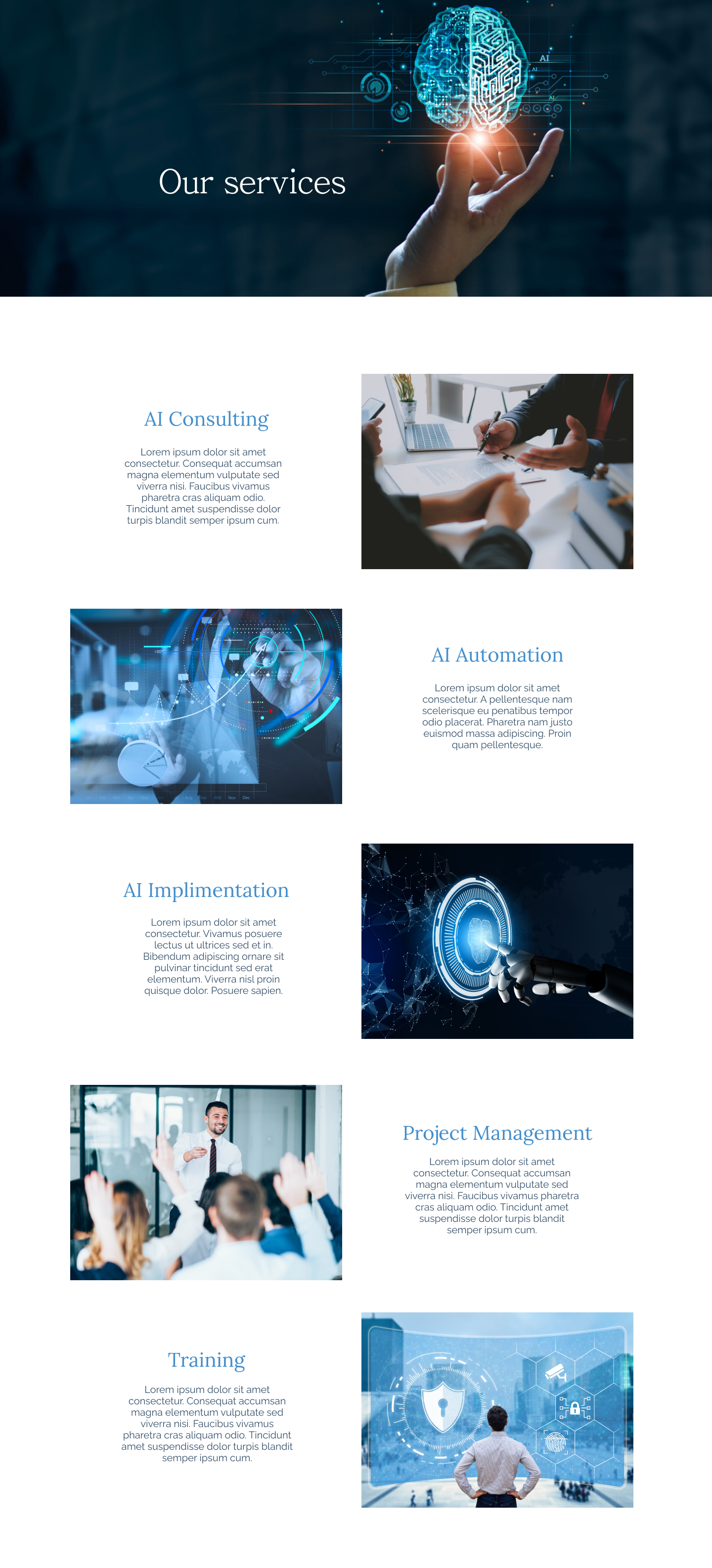
Redesigned our services
Tech motif
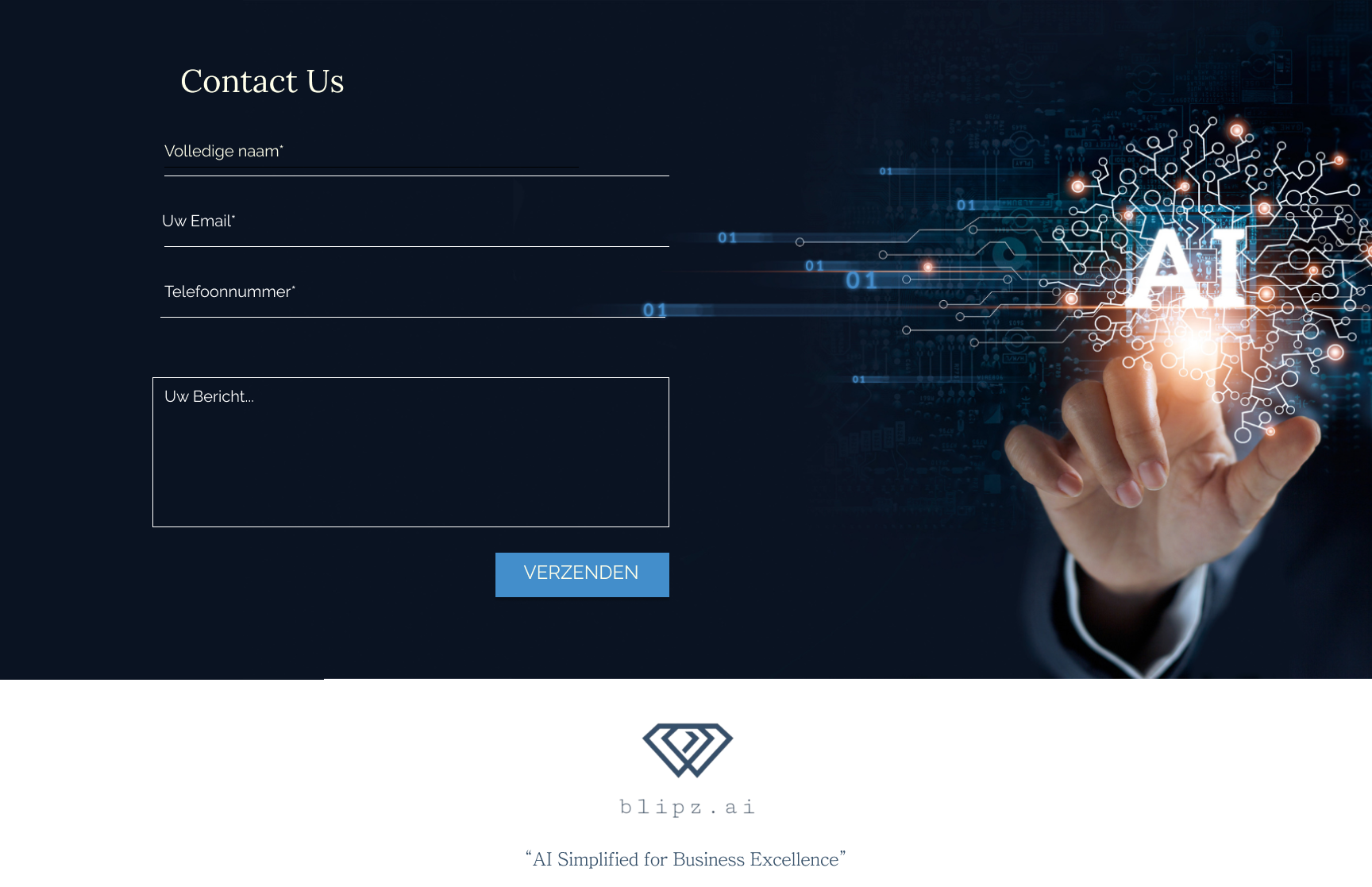
DRIVING ENGAGEMENT & ACTION
DRIVING ENGAGEMENT & ACTION
CONTACT FORM
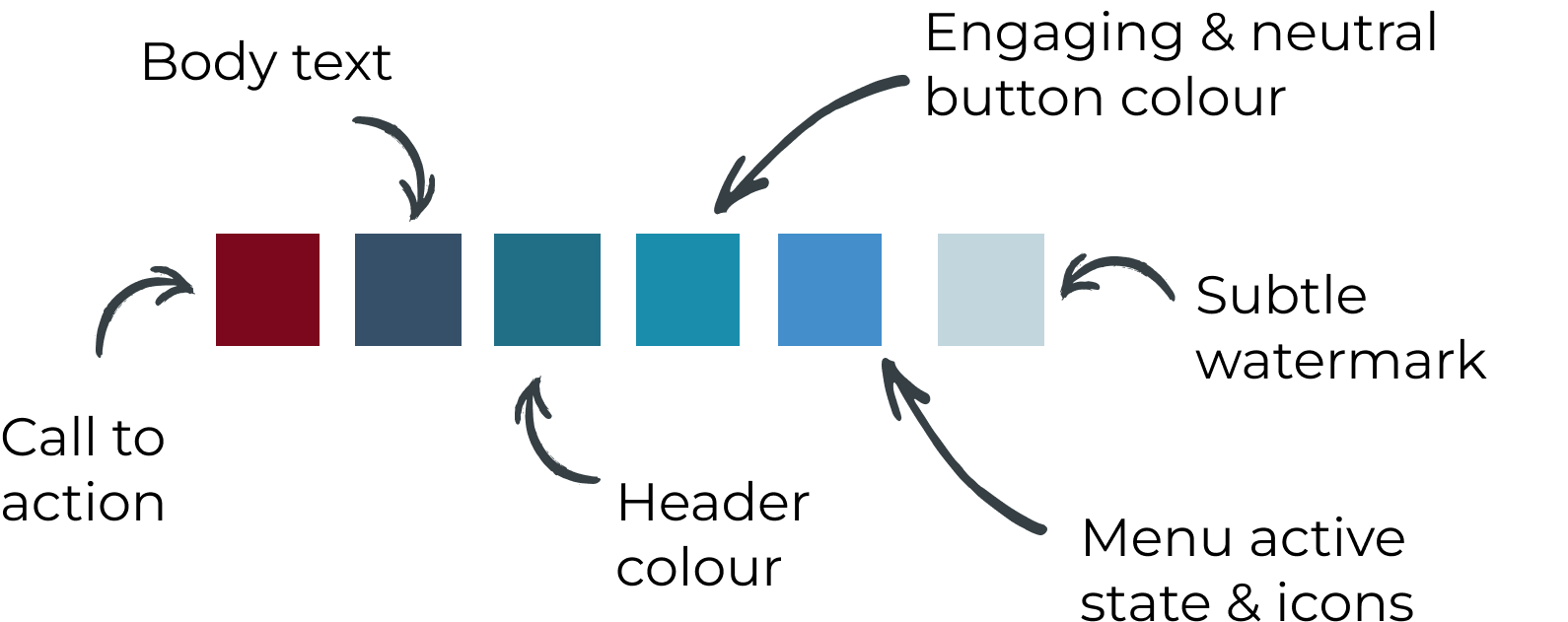
COLOUR
A cool, neutral color palette to convey trust and professionalism.
OUTCOMES & IMPACT
• Structured client + agency feedback loops
• Trust-led visual hierarchy and CTA placement
• Clean layout that stood out from text-heavy competitors
• A/B test CTA placement and copy variants
• Expand SEO content strategy around the new blog
• Build a more structured onboarding flow for new leads
That one decision, made through feedback, not assumption, was what made the difference between a website that informs and one that converts.