.png)
This UX case study explores a mobile-first camping store app designed to reduce friction throughout the gear-buying journey.
The solution focuses on clear categorisation, guided discovery, and scannable product information to help users quickly find gear that fits their experience level and camping style.
Sustainable options are integrated in a clear and accessible way, allowing users to make value-based choices without adding complexity to the shopping experience.
Helping Campers Choose Gear With Confidence
A mobile commerce app concept designed to make gear discovery, comparison, and checkout feel clearer for eco-conscious campers and families.
THE CHALLENGE
Camping has seen a surge in popularity, but buying camping gear online can feel overwhelming and inconsistent, particularly for beginners and busy families.
Users often struggle to understand what equipment they actually need, compare products confidently, and trust that their choices suit their camping style and values, such as sustainability.
The challenge was to design a mobile-first shopping experience that simplifies gear discovery, reduces cognitive load, and supports confident, informed decision-making across a wide range of user needs.
THE SOLUTION
RESEARCH & DISCOVERY
User Research Methods
To simulate real user insightst:
I used persona prompt generators to define baseline user types.
Conducted informal interviews with friends who camp regularly.
Reflected on my own camping habits to identify common behaviors and frustrations.
This approach allowed me to empathize with a range of potential users despite the limitations of a student project.
Key Personas Identified
SARAH
(Eco conscious user)
Seeks sustainable, high-quality gear and trustworthy product reviews.
Problem
Needs to quickly compare sustainable gear but struggles with cluttered, untrustworthy sites.
Hypothesis
If sustainability info and reviews are clear, she can make confident purchases faster.
JAMIE
(Casual adventurer)
Wants quick gear suggestions and simple guides for spontaneous weekend getaways.
Problem
Doesn’t have time to research gear or learn everything needed.
Hypothesis
If the app offers beginner guides and quick gear recs, he can plan spontaneous trips with less stress.
LINDA
(Older enthusiast)
Prioritizes comfort, expert recommendations, and accessibility.
Problem
Overwhelmed by too many options and unclear product details.
Hypothesis
A curated gear system, authentic reviews, and comparison tools can help her shop with ease and confidence.
MARK
(Family camper)
Needs durable, affordable, kid-safe gear and trip planning support.
Problem
Mark is a busy father who needs a mobile friendly experince becuase he struggles to compare family camping products online, especially on his Mobile.
Hypothesis
A mobile-friendly, intuitive UI will allow him to shop efficiently on-the-go.
Competitive audit & key insights
I evaluated five leading camping gear sites to identify usability patterns across mobile design, accessibility, and product clarity.
Common issues included cluttered layouts, confusing menus, and weak sustainability filters—frustrating for users like Jamie, Mark, and Sarah.
Overwhelming imagery and low-contrast interfaces also posed challenges, especially for older users like Linda.
Revisiting these audits during prototyping helped validate key design choices, like mobile-first layouts, icon-based trust signals, and a reintroduced gear comparison feature.
These insights directly shaped a cleaner, more accessible shopping experience for a wide range of camping styles.
USER FLOWS & WIREFRAMES
User flows designed
These flows address different user intents—from quick decisions to in-depth product comparison.
The quick path for users like Jamie
The path of comparison for users like Linda and Sarah
Wireframes & Ideation
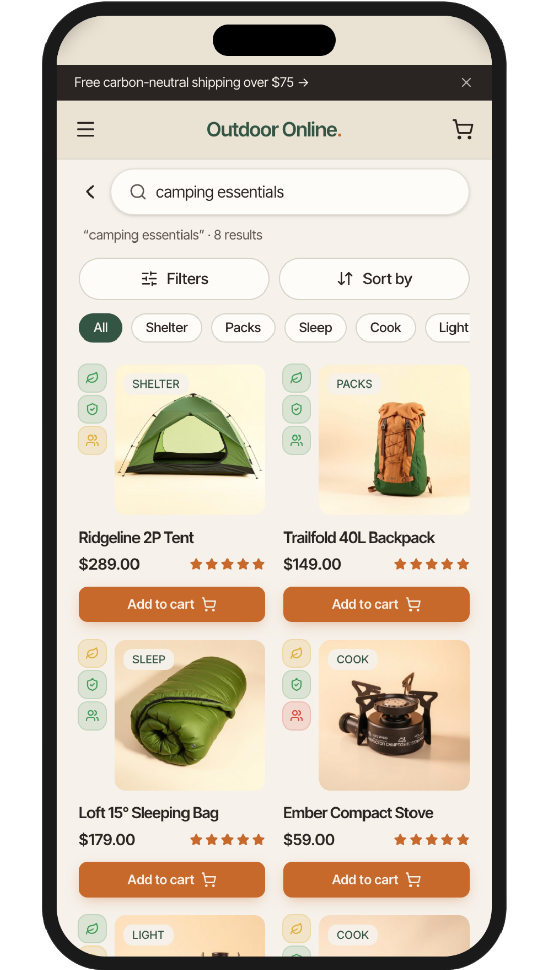
I translated the research and user flows into a small set of priority screens covering discovery, product comparison, cart, checkout, and confirmation.
The goal was to support two behaviours: users who want a fast path to the right gear, and users who need more confidence through comparison, ratings, and clearer product information.
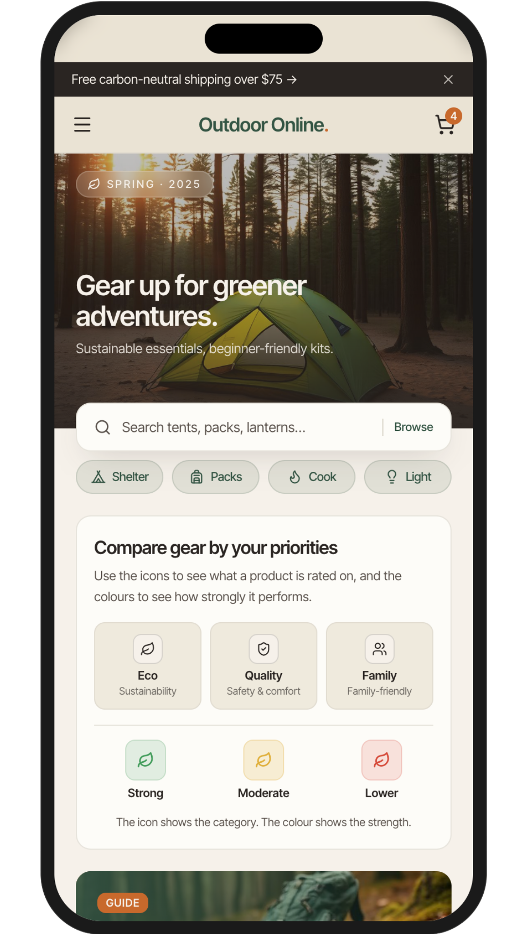
Early homepage wireframes prioritised search, guided categories, trust/rating cues, and beginner-friendly content while keeping the layout scannable and uncluttered.
FEATURE CONCEPTS
Early rating concept
Low
Mid
High
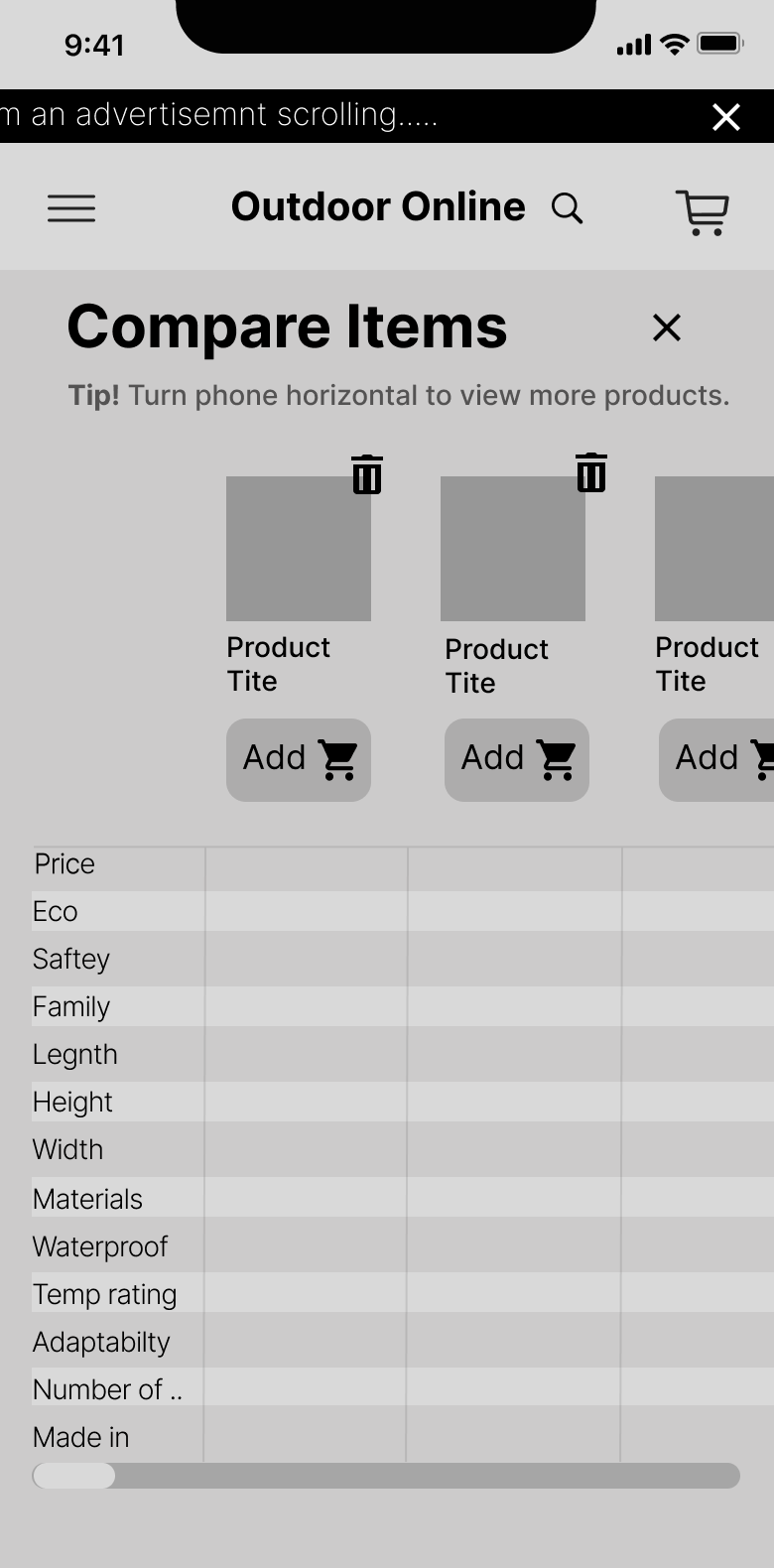
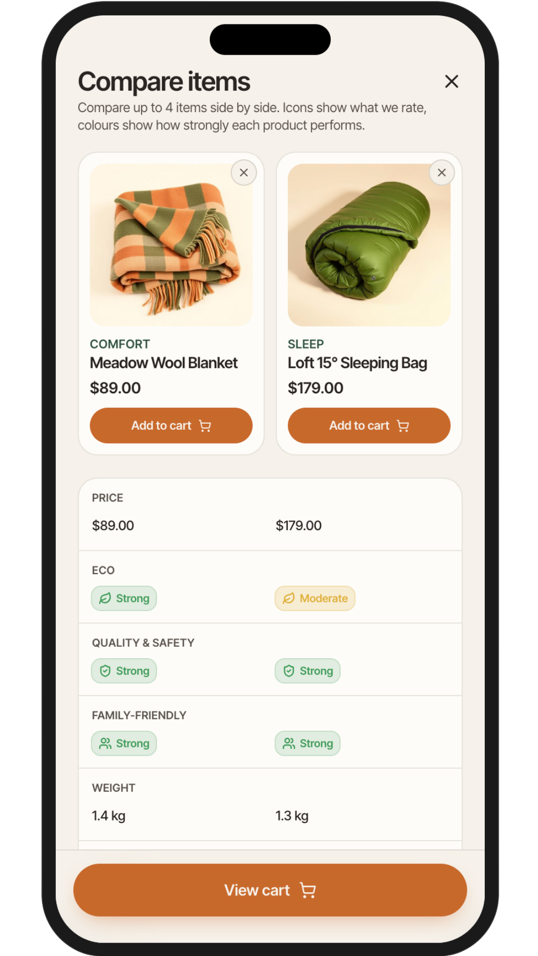
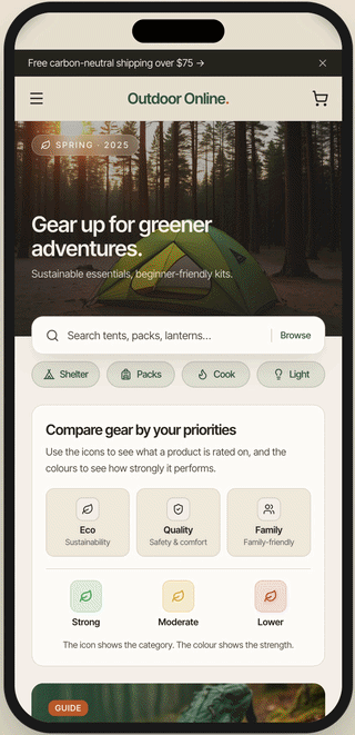
Helping Users Compare Gear Side By Side
Initially unsure about implementing a compare feature, I reconsidered after finding a strong example in a competitor audit.
The tool lets users compare price, specs, and value-based ratings in one place, helping detail-focused shoppers avoid second-guessing and helping faster shoppers scan options without opening multiple product pages. This was ideal for users like Linda and Mark.
This feature was especially relevant to Linda, who prefers side-by-side product comparisons to avoid second-guessing, and to Jamie, who benefits from quick overviews without digging deep into multiple product pages.
Cutting A Feature To Keep The Experience Focused
I explored an interactive gear-recommendation map based on camping location and experience level. While the idea had potential, it added too much complexity for the project scope and risked distracting from the core shopping journey.
I deprioritized it so the experience could stay focused on product discovery, comparison, and checkout.
PROTOTYPING & ITERATION
Refining The Experience Through Feedback
I reviewed the wireframes with peers and evaluated the flows using UX heuristics. Based on the feedback, I focused on reducing friction in two key areas: checkout and confirmation states.
Before
After
- This approach aligned with user expectations and made the process more digestible, especially for mobile users. It also supported users like Linda, who benefit from reduced cognitive load, and Mark, who values clear steps when shopping with family distractions.
Making Next Steps Clear After Key Actions
During prototype review, I noticed that users needed clearer feedback after adding an item to cart or comparison. I added confirmation states that reassure users their action was successful and give them clear next steps.
These modals let users continue shopping, view their cart, or move into the comparison path without losing momentum.
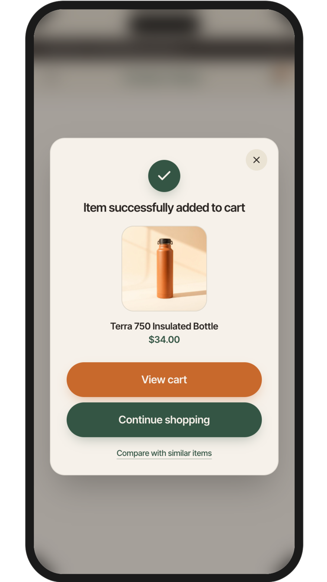
Added to cart confirmation
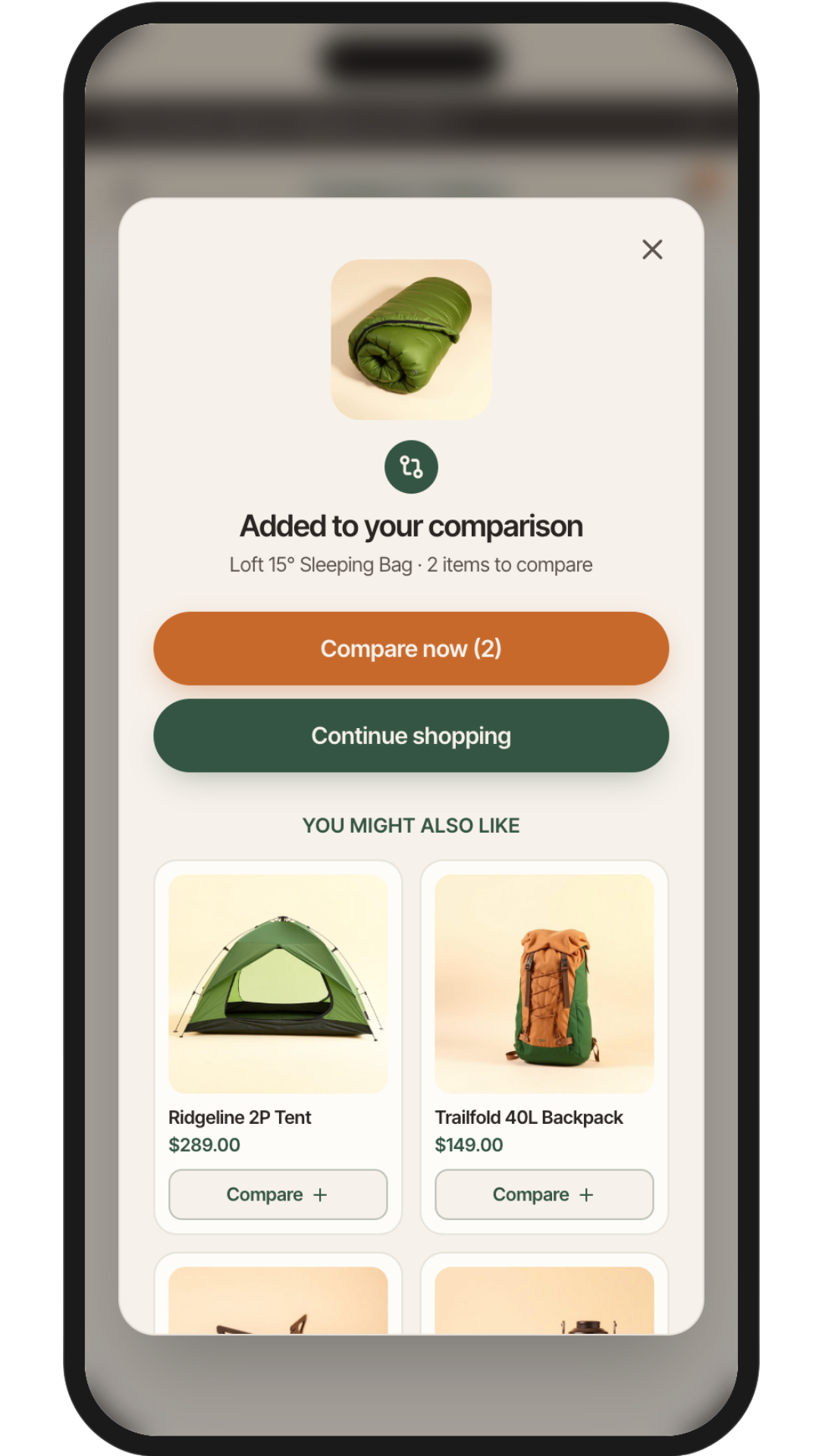
Added to compare confirmation
Prototyping
The Key User Journeys
I built an interactive prototype to walk both critical paths from start to finish: Jaime's quick-find journey and Linda's comparison flow, from browsing all the way through checkout.
A note on tooling: I used Lovable, an AI-powered build tool, to bring the prototype to life as a working web experience.
This meant I could test real tap interactions and flows without engineering support — and iterate on the live product the same way I'd iterate on a Figma file.
Design Reflection
What this project taught me
This concept reframed gear shopping around confidence rather than catalogue browsing.
The decisions I'm most proud of weren't feature additions, they were subtractions: cutting the location map, scoping the prototype to two journeys, stepping the checkout rather than stacking it.
Restraint was the main design skill here.

Every lesson here traces back to a real user.
If I did this again
01
Test earlier with real users
I made checkout decisions based on heuristics and peer feedback. Real usability testing, even just three sessions would have surfaced friction I couldn't anticipate from inside the design.
02
Invest more in Mark's persona
His needs were inferred rather than researched. Next time I'd spend time interviewing actual parents with young children before designing for them his persona was the weakest as a result.
03
Define accessibility requirements upfront
The rating system took several iterations to simplify because I didn't set accessibility constraints at the start. Setting them early would have saved time and produced a stronger first pass.
04
Prototype in Lovable sooner
Building the live prototype later in the process meant I missed a chance to test real interactions at low fidelity. Starting earlier would have shaped the Figma work, not just validated it.
